Oak Carpentry, Responsive WordPress Website Design | Orangebox Digital, Lancashiresoph-20262022-03-21T13:54:07+00:00

LR Finance, Wigan, WordPress Web Design | Orangebox Digital, Lancashiresoph-20262022-03-21T13:54:20+00:00

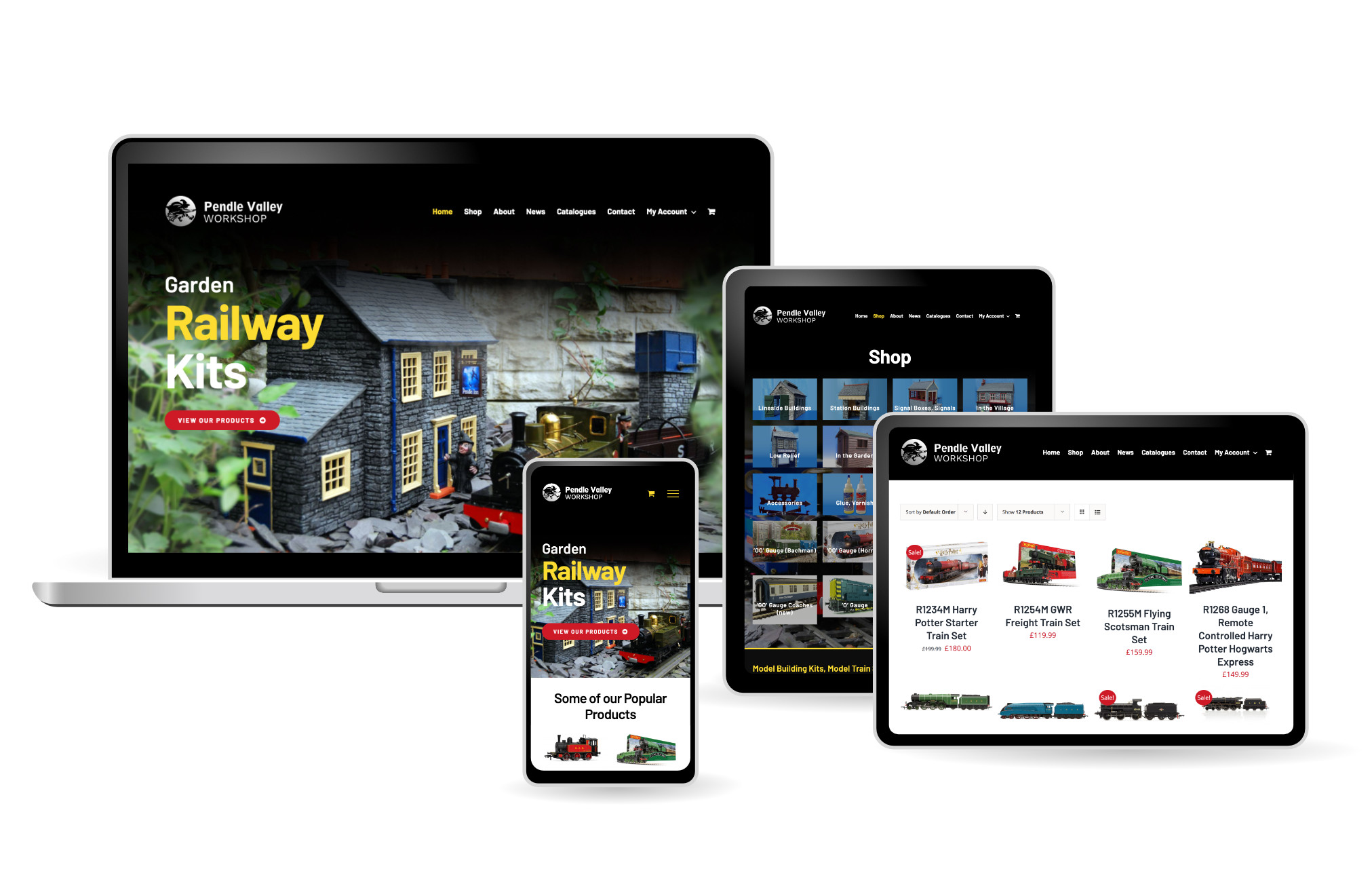
Pendle Valley Workshop, Carnforth Models, eCommerce Shop Web Design | Orangebox Digital, Lancashiresoph-20262022-03-21T15:04:11+00:00
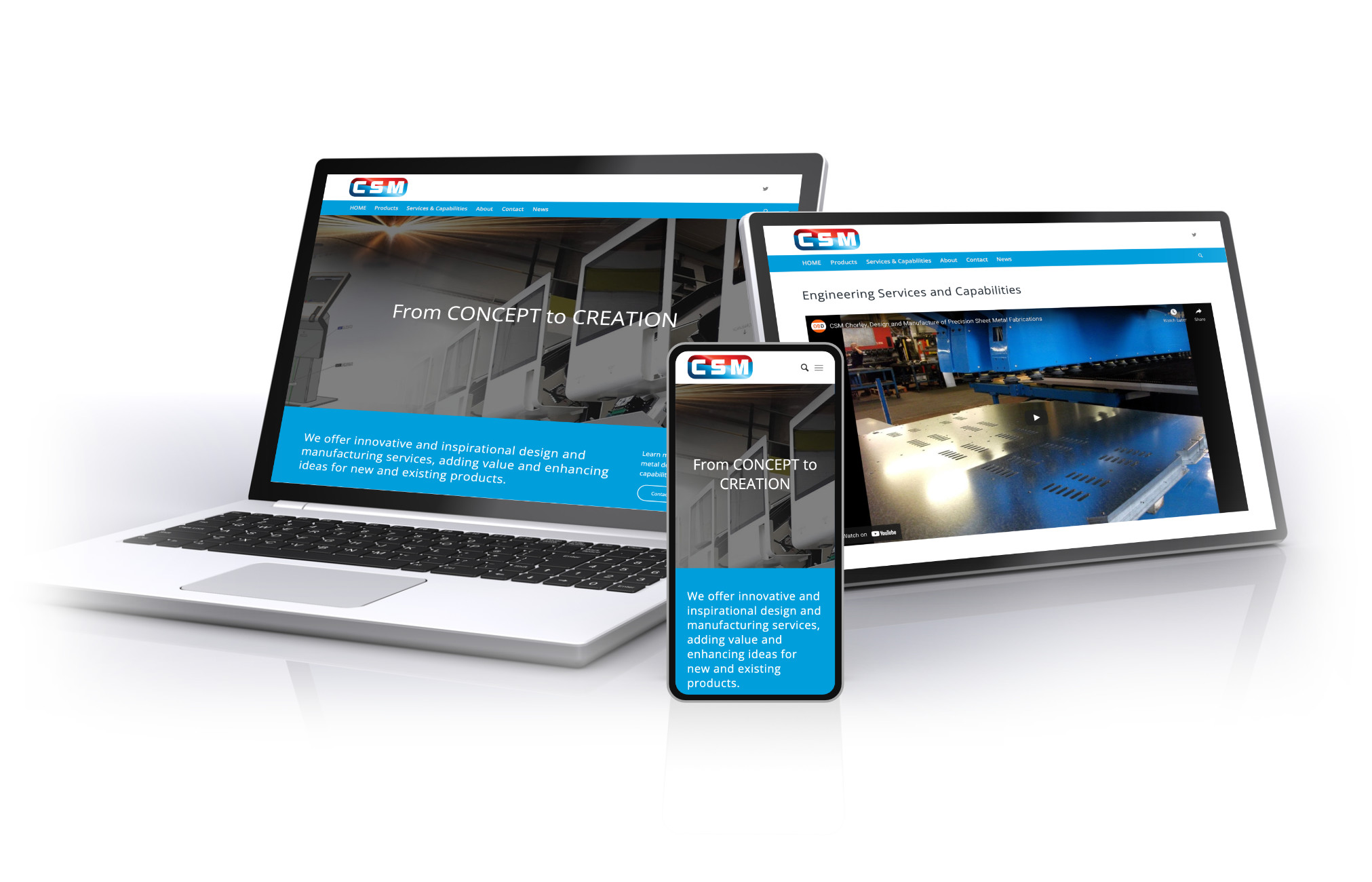
CSM, Chorley, WordPress Web Design | Orangebox Digital, Lancashiresoph-20262023-06-25T04:18:31+00:00
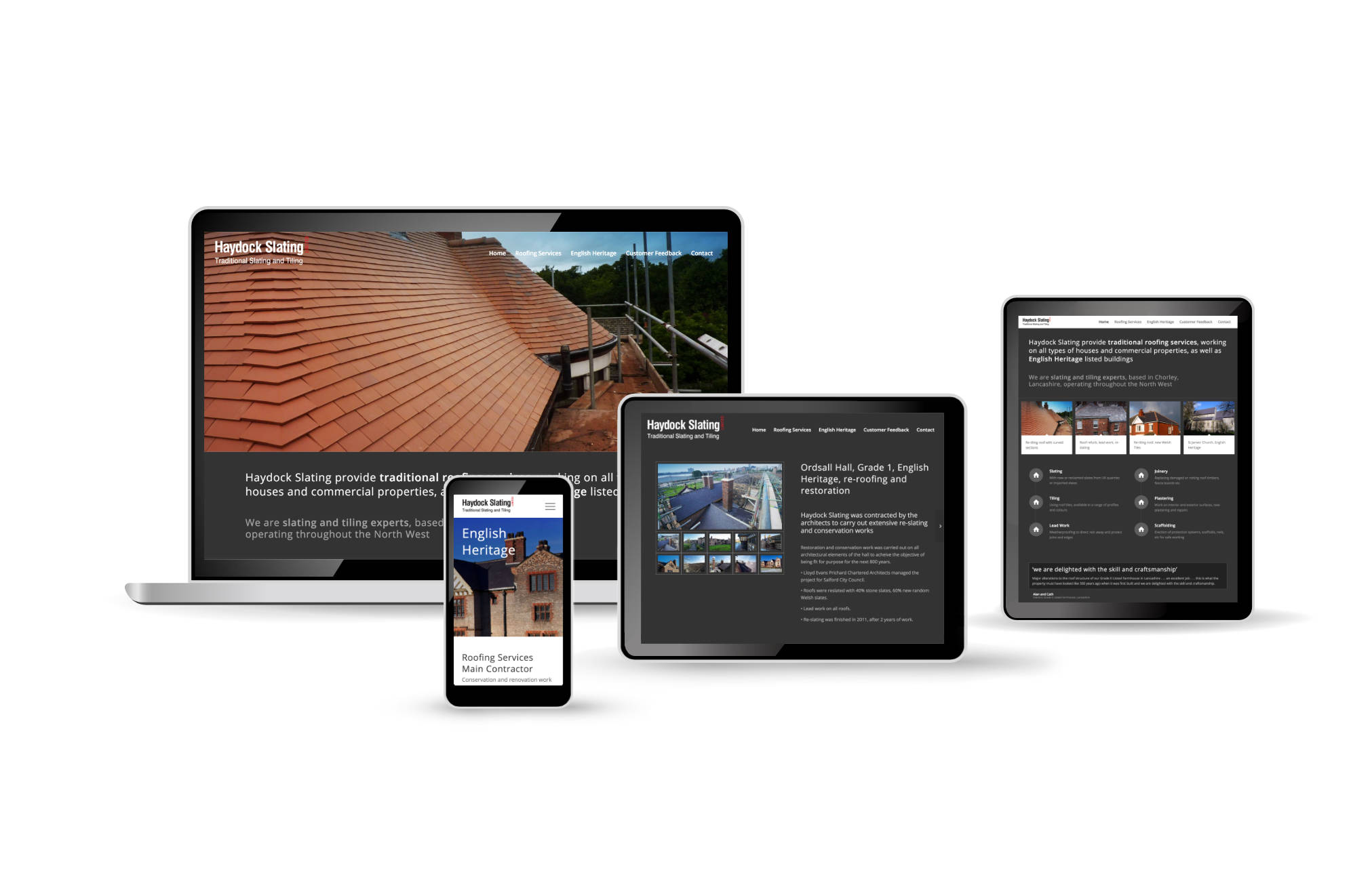
Haydock Slating, Roofing Contractor, WordPress Web Design | Orangebox Digital, Lancashiresoph-20262022-03-21T13:56:21+00:00
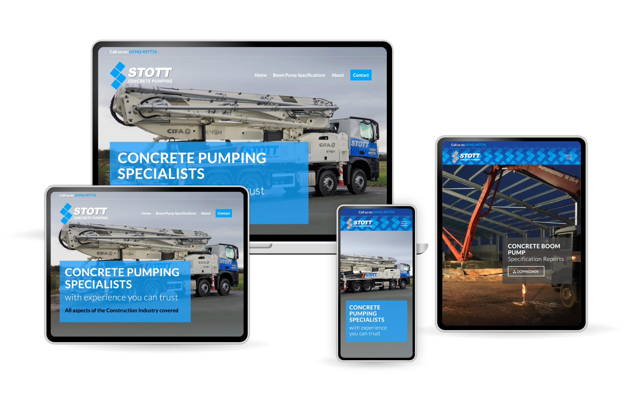
Stott Concrete Pumping, WordPress Website Design | Orangebox Digital, Lancashiresoph-20262026-01-25T23:02:27+00:00
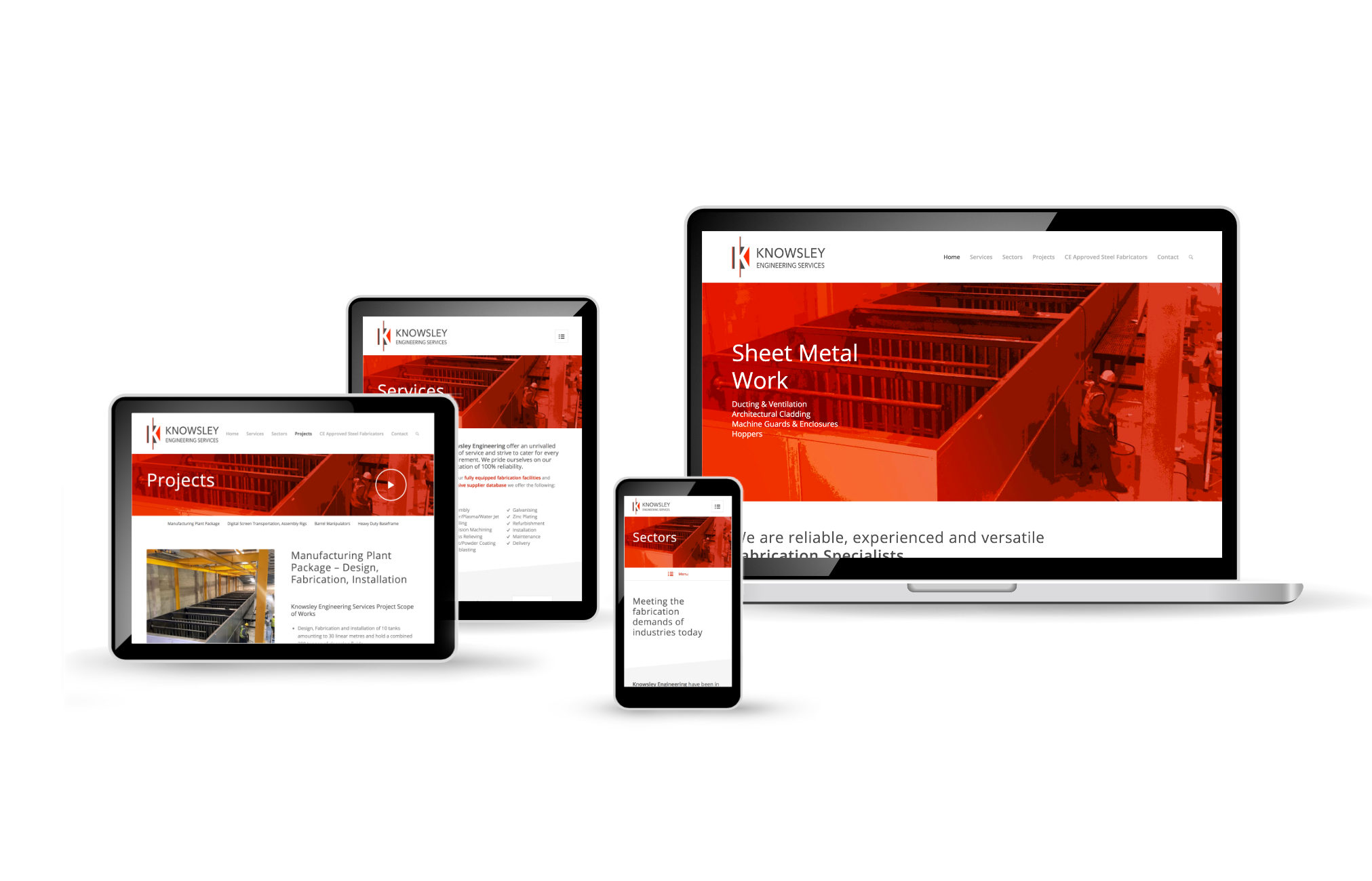
Knowsley Engineering, Skelmersdale, WordPress Web Design | Orangebox Digital, Lancashiresoph-20262022-03-21T13:55:13+00:00
RokSurfacing, Chester, Business Startup Website, Web Design | Orangebox Digital, Lancashiresoph-20262022-03-29T14:33:31+00:00

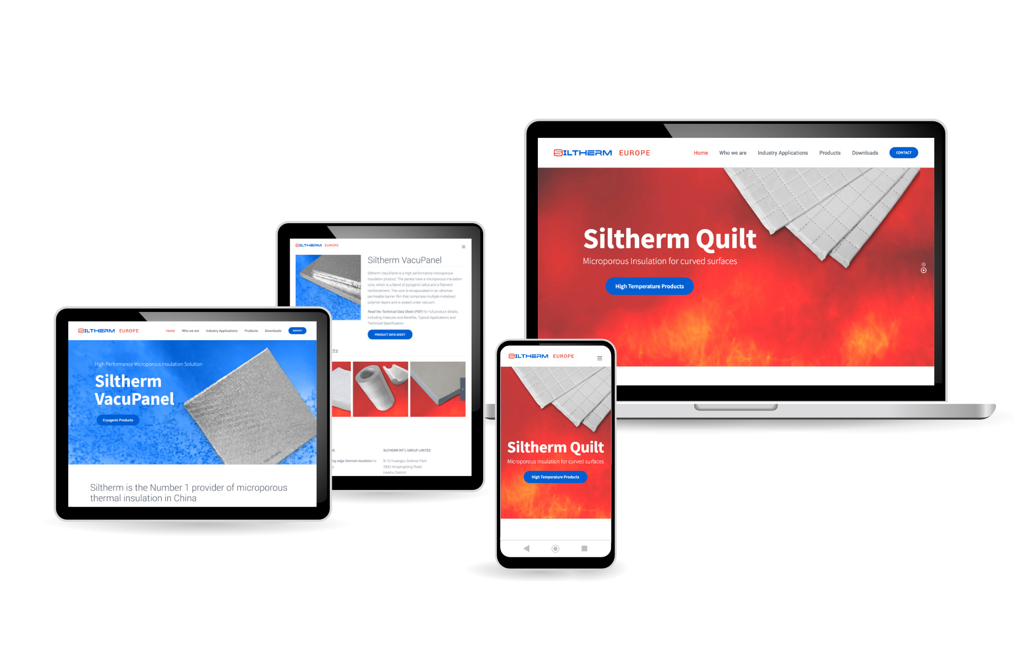
Siltherm Europe, WordPress Web Design | Orangebox Digital, Lancashiresoph-20262022-03-21T13:55:29+00:00
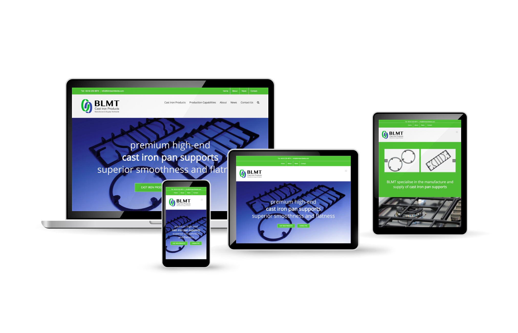
BLMT, Thailand, Manufacturer, Supplier, Cast Iron Products, WordPress Web Design | Orangebox Digital, Lancashiresoph-20262026-01-25T23:04:38+00:00
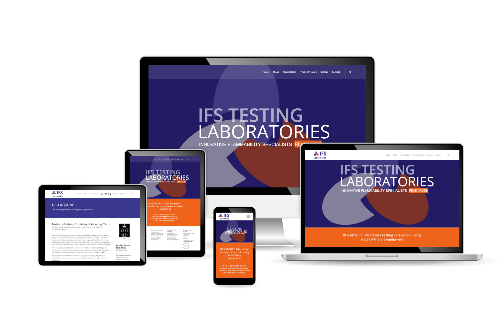
IFS Laboratories, Manchester, WordPress Web Design | Orangebox Digital, Lancashiresoph-20262022-03-21T13:57:41+00:00
ecigtesting, IFS Labs, Manchester, WordPress Web Design | Orangebox Digital, Lancashiresoph-20262022-03-21T13:58:07+00:00

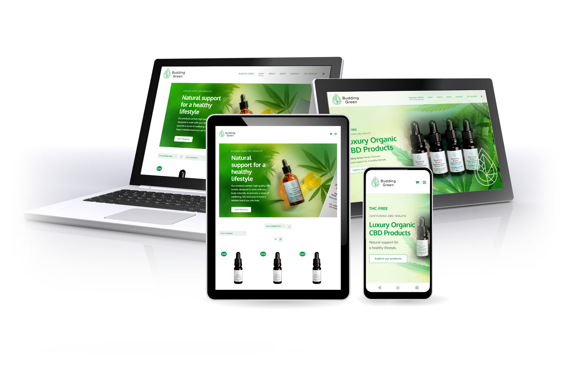
Budding Green, Online Shop, WordPress WooCommerce, Web Design | Orangebox Digital, Lancashiresoph-20262022-03-21T15:03:49+00:00
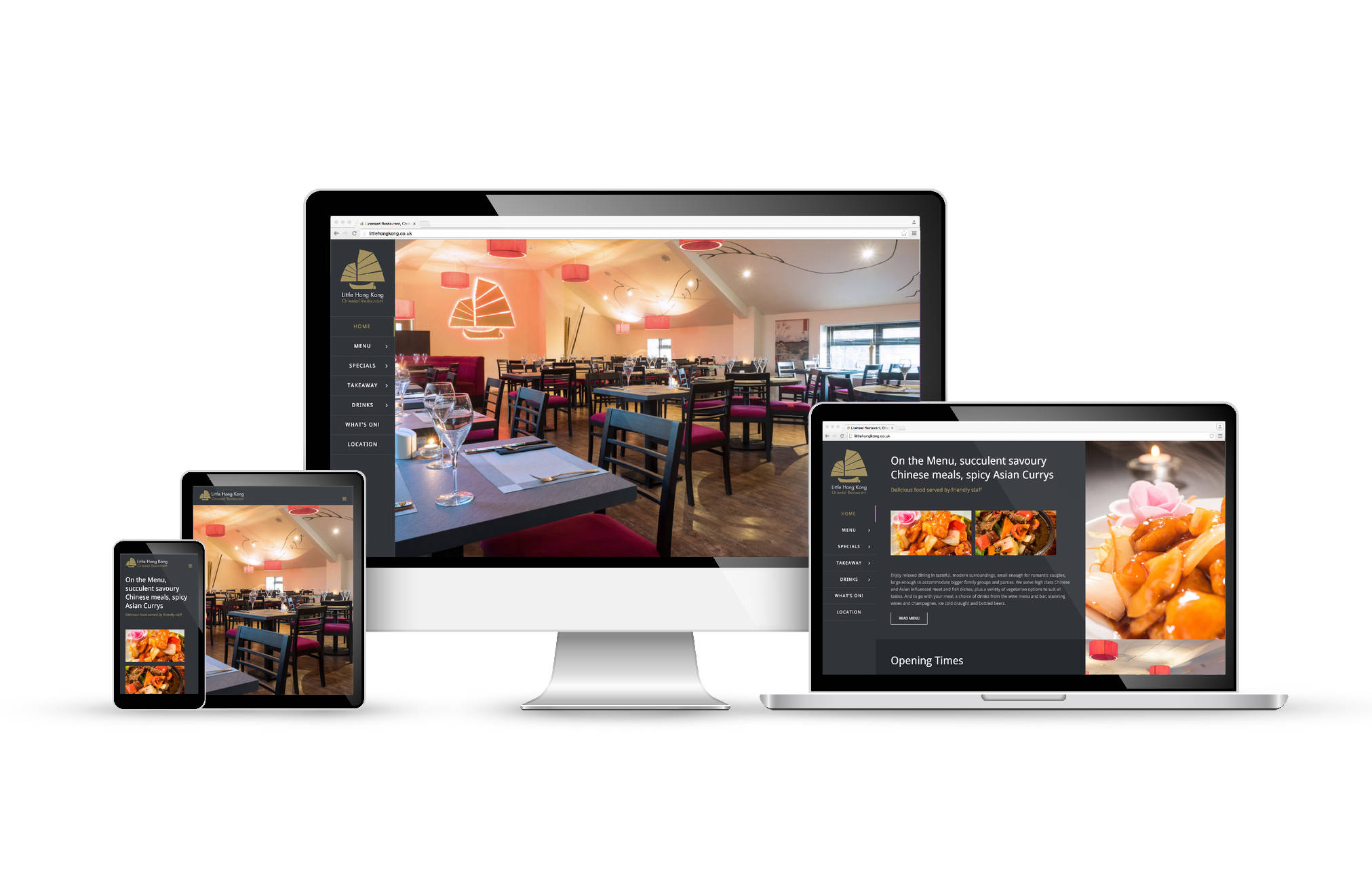
Little Hong Kong Restaurant, Chorley, WordPress Web Design | Orangebox Digital, Lancashiresoph-20262022-03-21T13:58:44+00:00
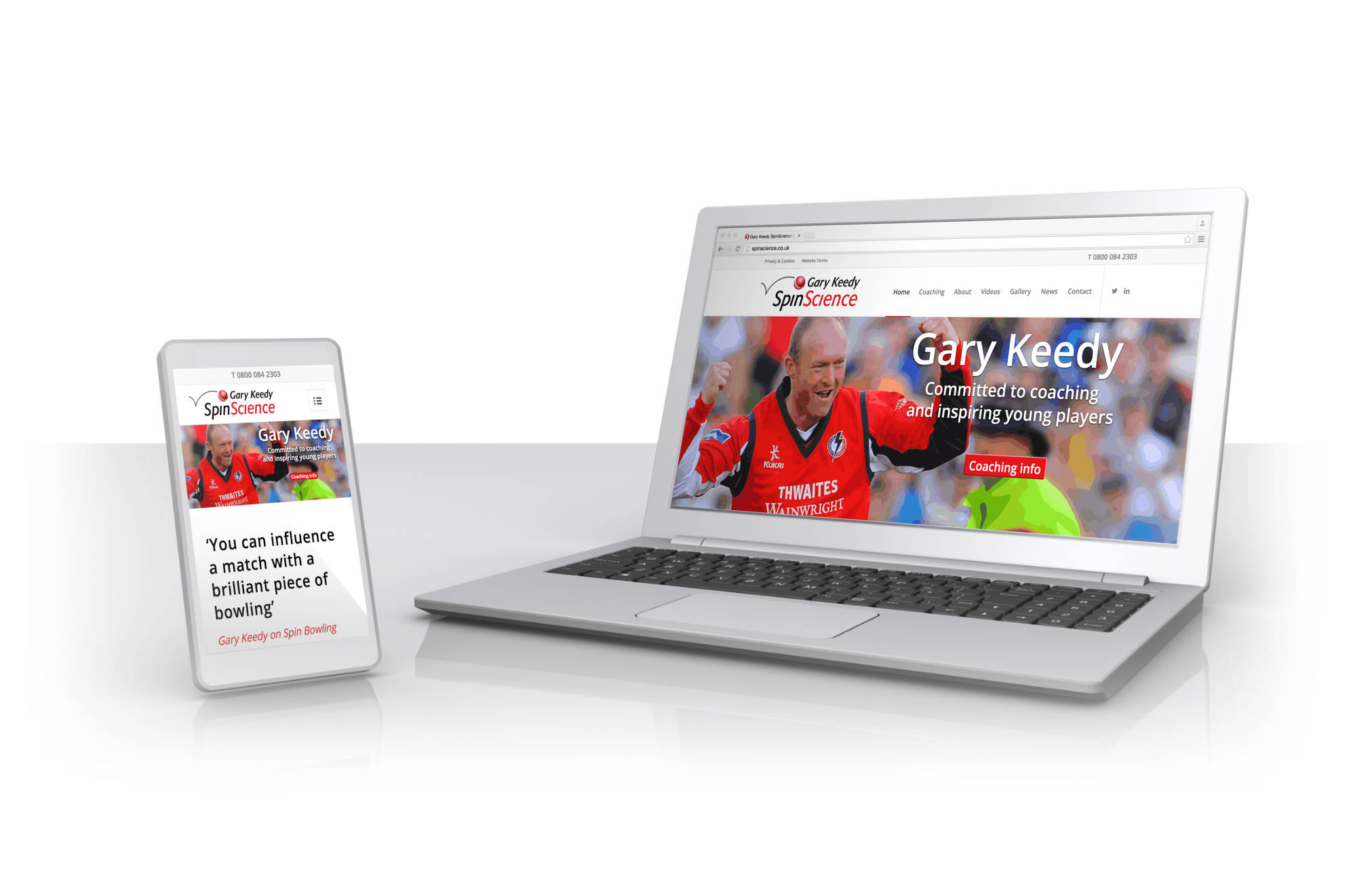
Gary Keedy SpinScience, WordPress Web Design | Orangebox Digital, Lancashiresoph-20262022-03-29T15:14:53+00:00
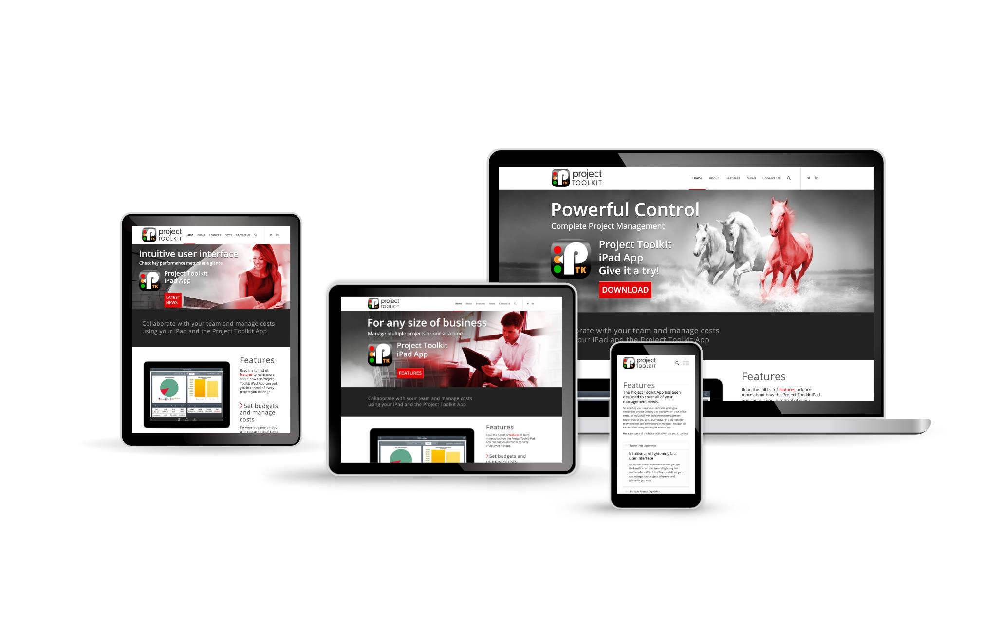
Project Toolkit, iPad App, WordPress Web Design | Orangebox Digital, Lancashiresoph-20262022-03-21T13:59:07+00:00
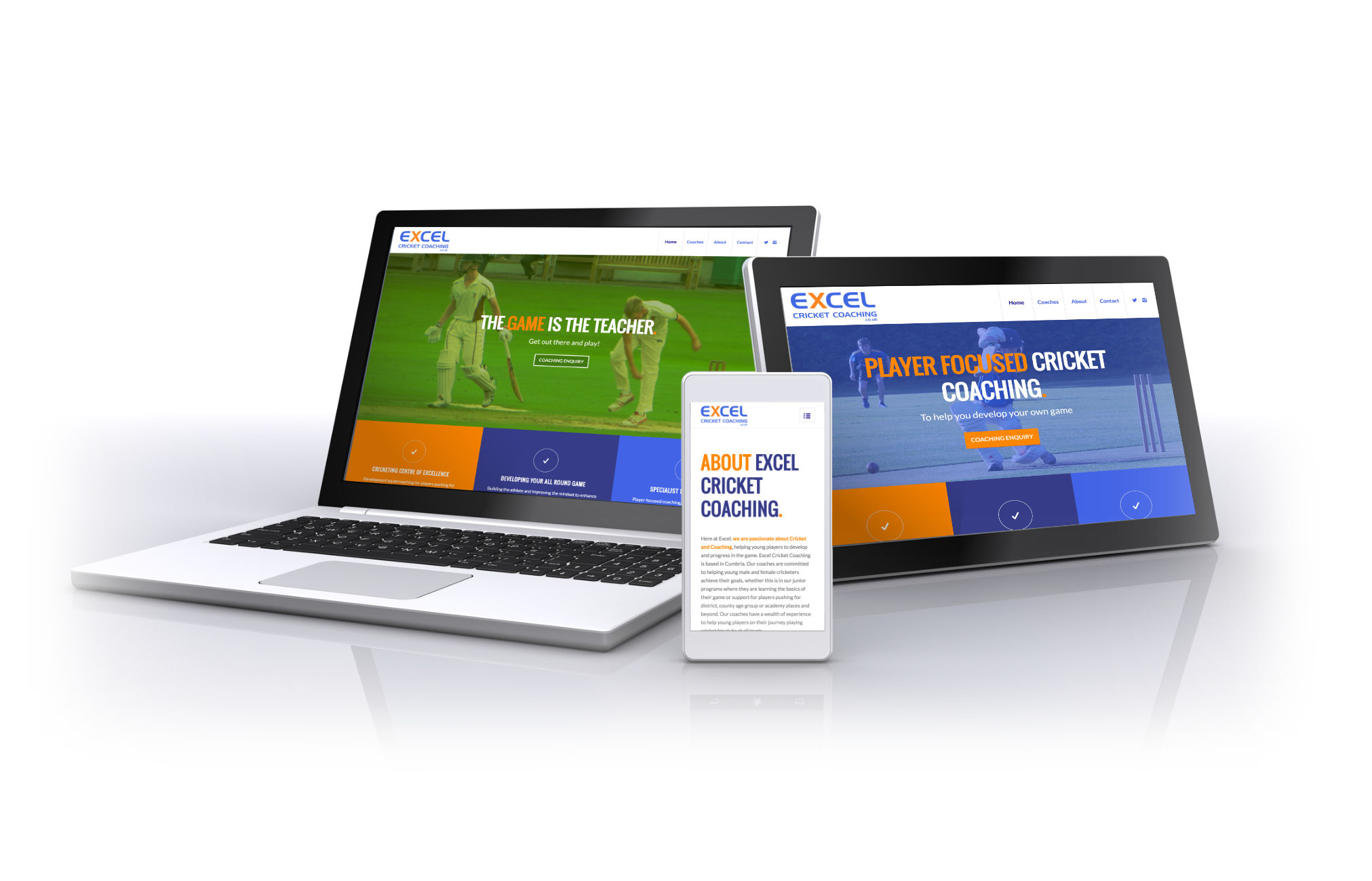
Excel Cricket Coaching, Cumbria, WordPress Web Design | Orangebox Digital, Lancashiresoph-20262022-03-21T13:59:35+00:00
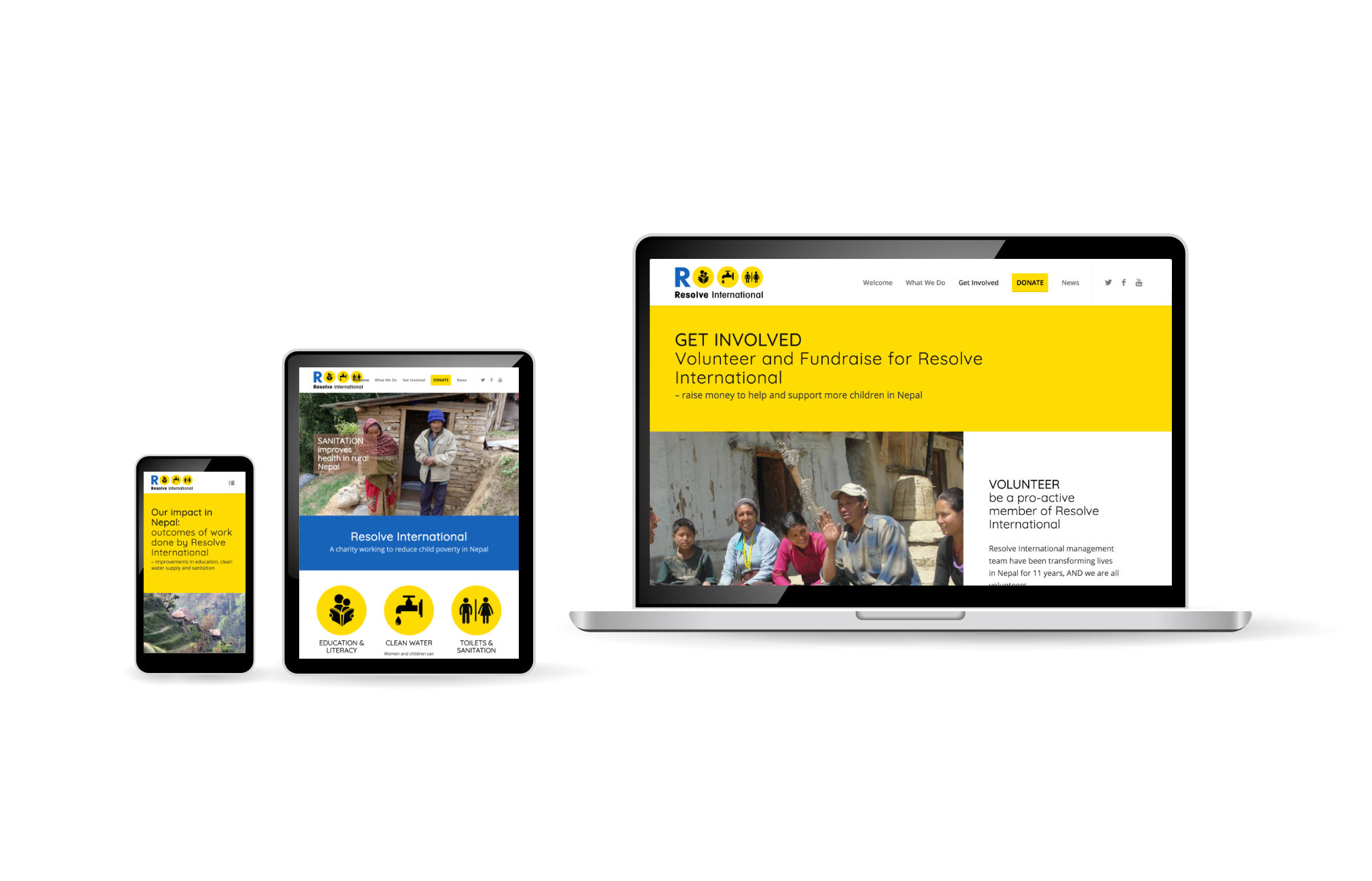
Resolve International, Charity, Clean Water, Toilets, Nepal, WordPress Web Design | Orangebox Digital, Lancashiresoph-20262022-03-21T14:00:49+00:00
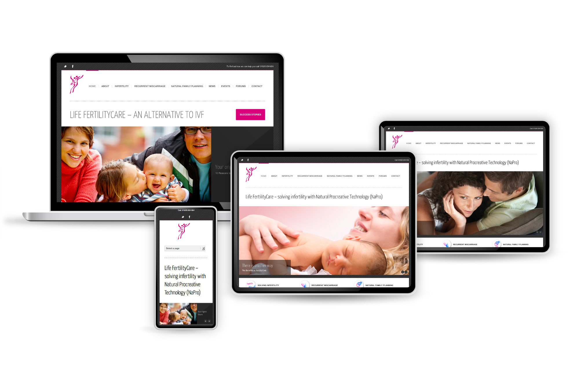
Life FertilityCare, Leamington Spa, WordPress Website Design | Orangebox Digital, Lancashiresoph-20262022-03-29T15:14:01+00:00
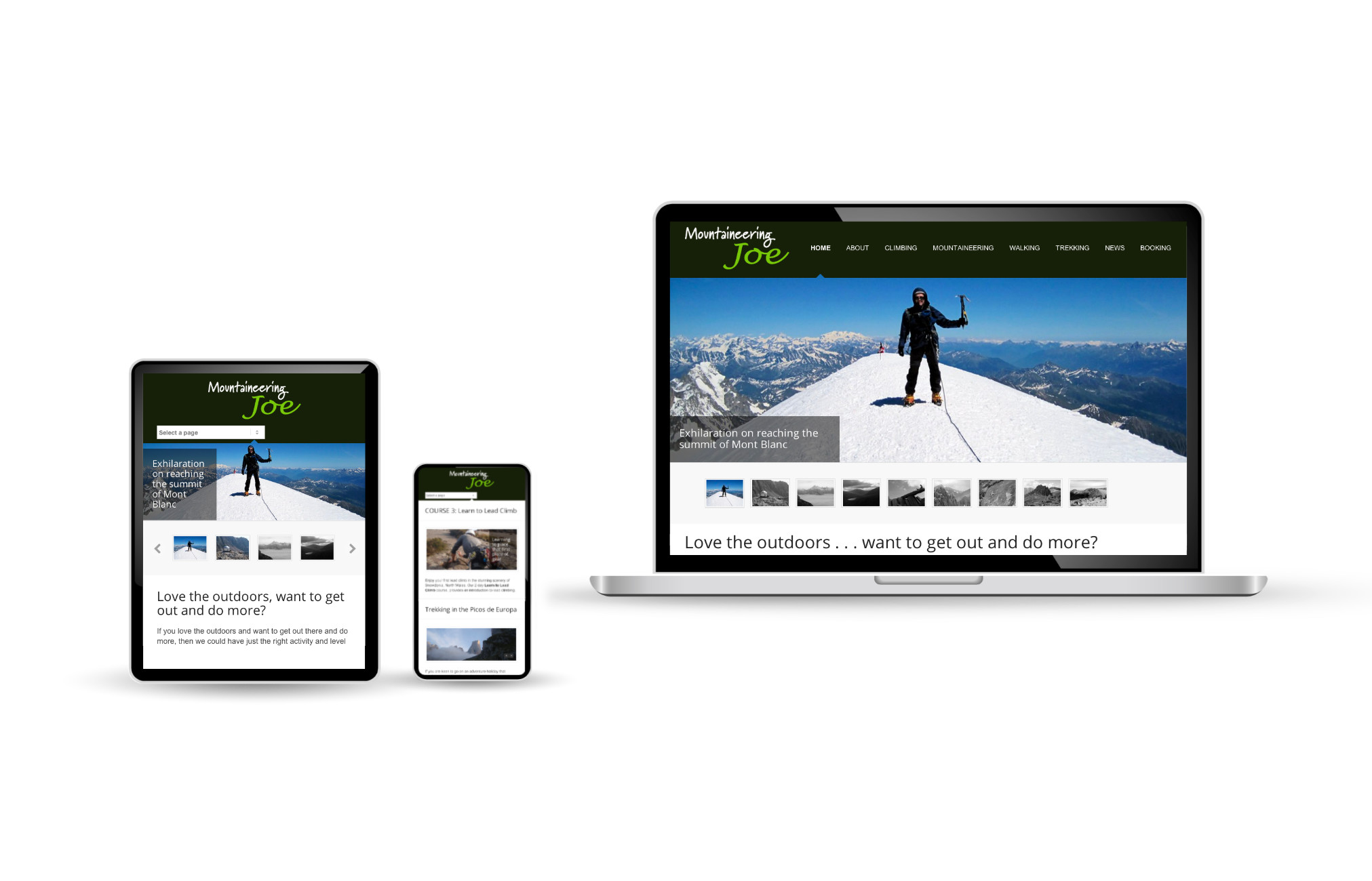
Mountaineering Joe, WordPress Web Design | Orangebox Digital, Lancashiresoph-20262026-01-25T23:06:16+00:00
Blakedale Road Marker Posts, Shop Web Design, Opencart | Orangebox Digital, Lancashiresoph-20262022-03-29T15:33:07+00:00

Head2Beauty, Hair Stylist, eCommerce Shop Web Design, Opencart | Orangebox Digital, Lancashiresoph-20262022-03-29T15:33:55+00:00

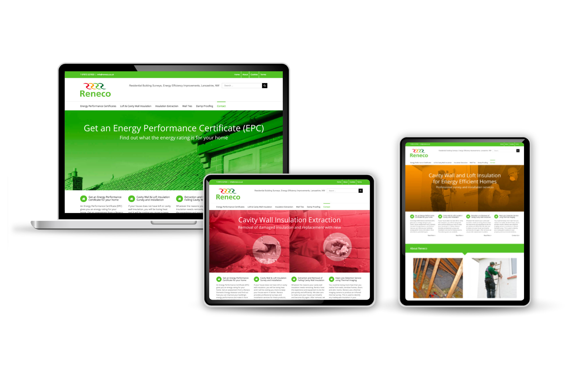
Reneco Energy Efficiency Improvements, Skelmersdale, WordPress Website Design | Orangebox Digital, Lancashiresoph-20262022-03-21T14:03:09+00:00
LK Property Developers, Cannes, France, Website Design | Orangebox Digital, Lancashiresoph-20262022-03-29T15:43:10+00:00

Websites
Examples of Responsive, Mobile Friendly Web Design by Orangebox Digital
Oak Carpentry, Responsive WordPress Website Design | Orangebox Digital, Lancashiresoph-20262022-03-21T13:54:07+00:00
LR Finance, Wigan, WordPress Web Design | Orangebox Digital, Lancashiresoph-20262022-03-21T13:54:20+00:00
Pendle Valley Workshop, Carnforth Models, eCommerce Shop Web Design | Orangebox Digital, Lancashiresoph-20262022-03-21T15:04:11+00:00
CSM, Chorley, WordPress Web Design | Orangebox Digital, Lancashiresoph-20262023-06-25T04:18:31+00:00
Haydock Slating, Roofing Contractor, WordPress Web Design | Orangebox Digital, Lancashiresoph-20262022-03-21T13:56:21+00:00
Stott Concrete Pumping, WordPress Website Design | Orangebox Digital, Lancashiresoph-20262026-01-25T23:02:27+00:00
Knowsley Engineering, Skelmersdale, WordPress Web Design | Orangebox Digital, Lancashiresoph-20262022-03-21T13:55:13+00:00
RokSurfacing, Chester, Business Startup Website, Web Design | Orangebox Digital, Lancashiresoph-20262022-03-29T14:33:31+00:00
Siltherm Europe, WordPress Web Design | Orangebox Digital, Lancashiresoph-20262022-03-21T13:55:29+00:00
BLMT, Thailand, Manufacturer, Supplier, Cast Iron Products, WordPress Web Design | Orangebox Digital, Lancashiresoph-20262026-01-25T23:04:38+00:00
IFS Laboratories, Manchester, WordPress Web Design | Orangebox Digital, Lancashiresoph-20262022-03-21T13:57:41+00:00
ecigtesting, IFS Labs, Manchester, WordPress Web Design | Orangebox Digital, Lancashiresoph-20262022-03-21T13:58:07+00:00
Budding Green, Online Shop, WordPress WooCommerce, Web Design | Orangebox Digital, Lancashiresoph-20262022-03-21T15:03:49+00:00
Little Hong Kong Restaurant, Chorley, WordPress Web Design | Orangebox Digital, Lancashiresoph-20262022-03-21T13:58:44+00:00
Gary Keedy SpinScience, WordPress Web Design | Orangebox Digital, Lancashiresoph-20262022-03-29T15:14:53+00:00
Project Toolkit, iPad App, WordPress Web Design | Orangebox Digital, Lancashiresoph-20262022-03-21T13:59:07+00:00
Excel Cricket Coaching, Cumbria, WordPress Web Design | Orangebox Digital, Lancashiresoph-20262022-03-21T13:59:35+00:00
Resolve International, Charity, Clean Water, Toilets, Nepal, WordPress Web Design | Orangebox Digital, Lancashiresoph-20262022-03-21T14:00:49+00:00
Life FertilityCare, Leamington Spa, WordPress Website Design | Orangebox Digital, Lancashiresoph-20262022-03-29T15:14:01+00:00
Mountaineering Joe, WordPress Web Design | Orangebox Digital, Lancashiresoph-20262026-01-25T23:06:16+00:00
Blakedale Road Marker Posts, Shop Web Design, Opencart | Orangebox Digital, Lancashiresoph-20262022-03-29T15:33:07+00:00
Head2Beauty, Hair Stylist, eCommerce Shop Web Design, Opencart | Orangebox Digital, Lancashiresoph-20262022-03-29T15:33:55+00:00
Reneco Energy Efficiency Improvements, Skelmersdale, WordPress Website Design | Orangebox Digital, Lancashiresoph-20262022-03-21T14:03:09+00:00
LK Property Developers, Cannes, France, Website Design | Orangebox Digital, Lancashiresoph-20262022-03-29T15:43:10+00:00
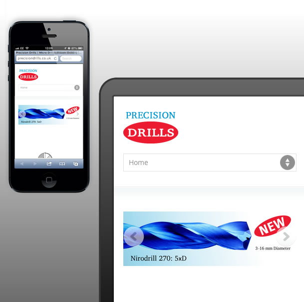
Precision Drills, Responsive Web Design, Landing Page | Orangebox Digital, Lancashiresoph-20262022-03-29T15:44:00+00:00
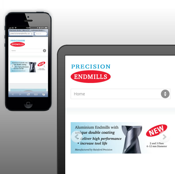
Precision Endmills, Responsive Web Design, Landing Page | Orangebox Digital, Lancashiresoph-20262022-03-29T15:44:35+00:00
Ultra Precision Machining, Responsive Web Design, Landing Page | Orangebox Digital, Lancashiresoph-20262022-03-29T15:45:10+00:00

Peter E Gilkes Property Website, Web Design, Sales, Letting, Rentals | Orangebox Digital, Lancs, NWsoph-20262022-03-29T15:45:52+00:00

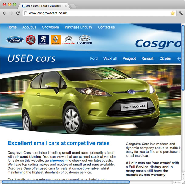
Cosgrove Cars Sales Custom CMS Web Design | Orangebox Digital, Lancssoph-20262022-03-29T15:56:26+00:00
Go Instruct, eCommerce, Web Design with Custom CMS | Orangebox Digital, Lancashiresoph-20262022-03-29T15:58:39+00:00


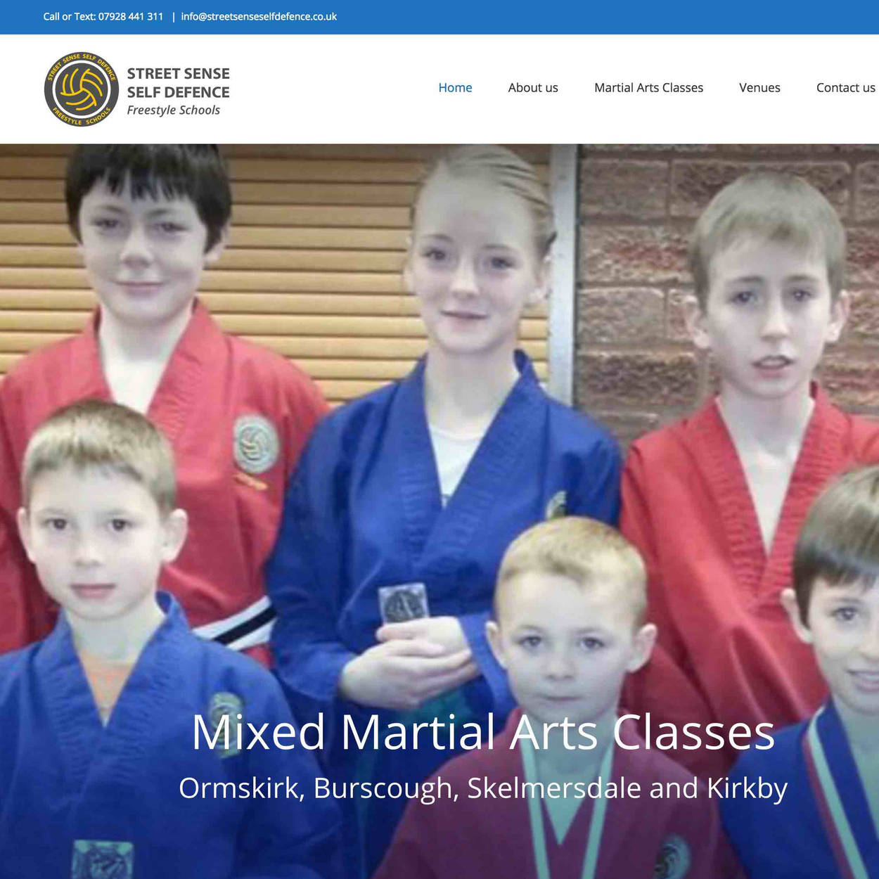
Street Sense Self Defence (SSSD) Freestyle Karate School, WordPress Web Designsoph-20262022-02-11T13:31:45+00:00
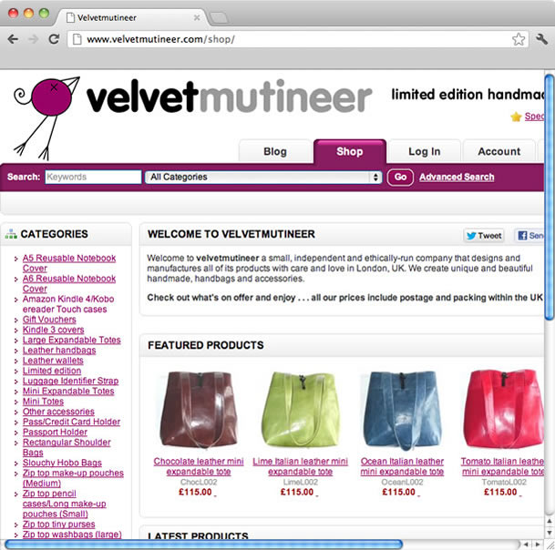
Velvetmutineer Shop Web Design, eCommerce Website | Orangebox Digital, Lancashiresoph-20262022-03-29T16:06:25+00:00
Websites
Examples of Responsive, Mobile Friendly Web Design by Orangebox Digital
More Web Design Projects
Precision Drills, Responsive Web Design, Landing Page | Orangebox Digital, Lancashiresoph-20262022-03-29T15:44:00+00:00
Precision Endmills, Responsive Web Design, Landing Page | Orangebox Digital, Lancashiresoph-20262022-03-29T15:44:35+00:00
Ultra Precision Machining, Responsive Web Design, Landing Page | Orangebox Digital, Lancashiresoph-20262022-03-29T15:45:10+00:00
Peter E Gilkes Property Website, Web Design, Sales, Letting, Rentals | Orangebox Digital, Lancs, NWsoph-20262022-03-29T15:45:52+00:00
Cosgrove Cars Sales Custom CMS Web Design | Orangebox Digital, Lancssoph-20262022-03-29T15:56:26+00:00
Go Instruct, eCommerce, Web Design with Custom CMS | Orangebox Digital, Lancashiresoph-20262022-03-29T15:58:39+00:00
Street Sense Self Defence (SSSD) Freestyle Karate School, WordPress Web Designsoph-20262022-02-11T13:31:45+00:00
Velvetmutineer Shop Web Design, eCommerce Website | Orangebox Digital, Lancashiresoph-20262022-03-29T16:06:25+00:00